This landing page audit checklist was created based on my experience analyzing 200+ SaaS websites over the last couple of years.
Below are the guidelines your landing page needs to follow to be in the top 10% of the highest-converting pages on the Internet.
The type of element, content or attribute the task is associated with.
The type of element, content or attribute the task is associated with.
The type of element, content or attribute the task is associated with.
These are the key items your landing page should check off. Don't move further without making sure these guidelines are met.
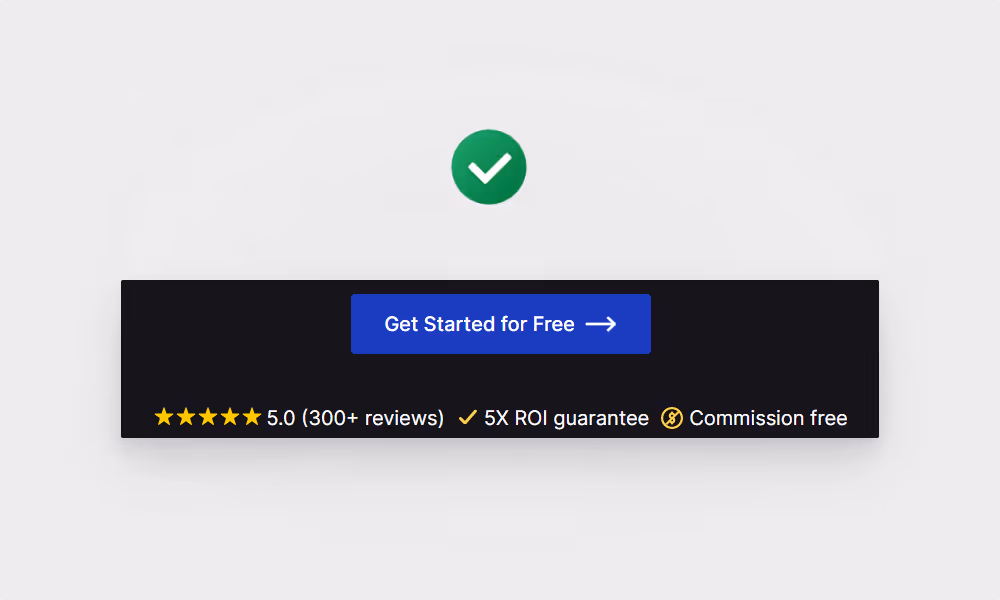
Two CTAs are fine (e.g. signup and demo lead to the same end goal), as long as the end goal is the signup.
Jacob’s Law says that “users spend most of their time on other sites”. This means that users prefer your site to look and work the same way as all the other sites they already know.
The more complex the offer (and the lower the users’ awareness), the more content should be used to explain it and convince users to take action.
As a rule of thumb, your page should contain at least as many words as you’d use when selling your product face-to-face. That’s because you don’t have the luxury of being able to ask for objections, so your page needs to address all of the most common objections. [per Conversion Rate Experts]
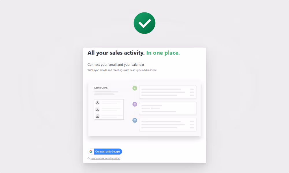
Hero section is the most important part of the landing page as it's seen by 100% of visitors. If you fail to grab visitors' attention at this point, they won't scroll down to learn more about your product.

Within 5 seconds after landing on the page, users are able to answer the following questions:

Here’s a list of proven headline formulas for inspiration.


After successfully grabbing users' attention with your hero section, you should use the body section to show them how your product works, how it solves their problems, and how it is a better choice than their existing solution.
Rule of thumb: use as many ‘you’ and as few ‘we’ as possible.

The more direct the copy, the more users will care about your message.
The alternative solution very often isn’t your direct competitor. It can be Excel or a piece of paper. It’s crucial to know what your prospective users compare your product to in their minds so you can use a relevant comparison.


Your prospects always have certain doubts and uncertainties when researching the right solution for their needs. Being upfront about them makes users confident your product can handle them.

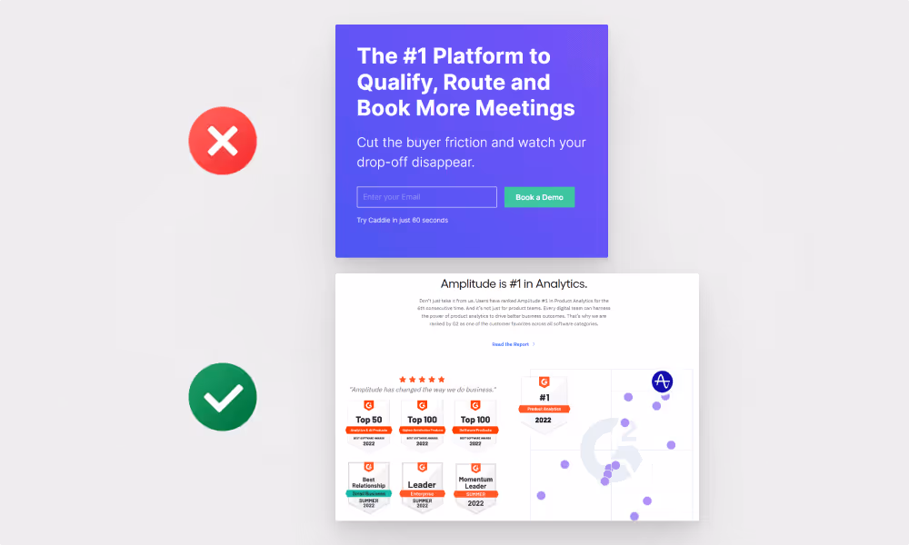
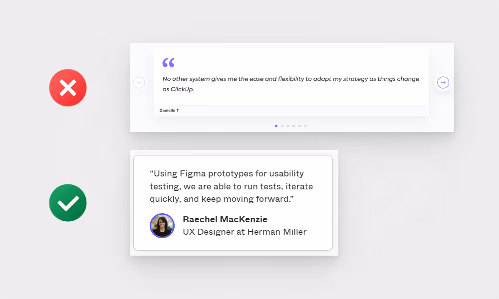
For example, ‘best landing page builder’ backed by G2 rating and/or badge. ‘Easy to use’ backed by a customer testimonial mentioning this specific benefit.
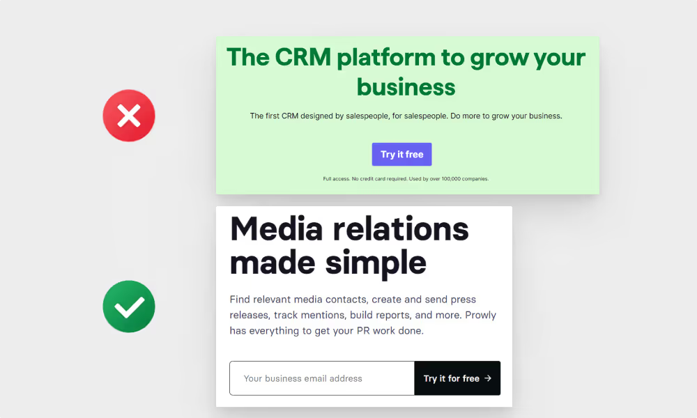
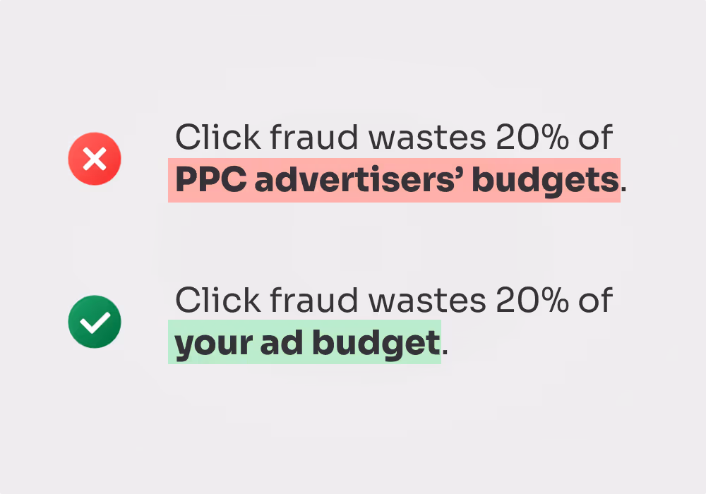
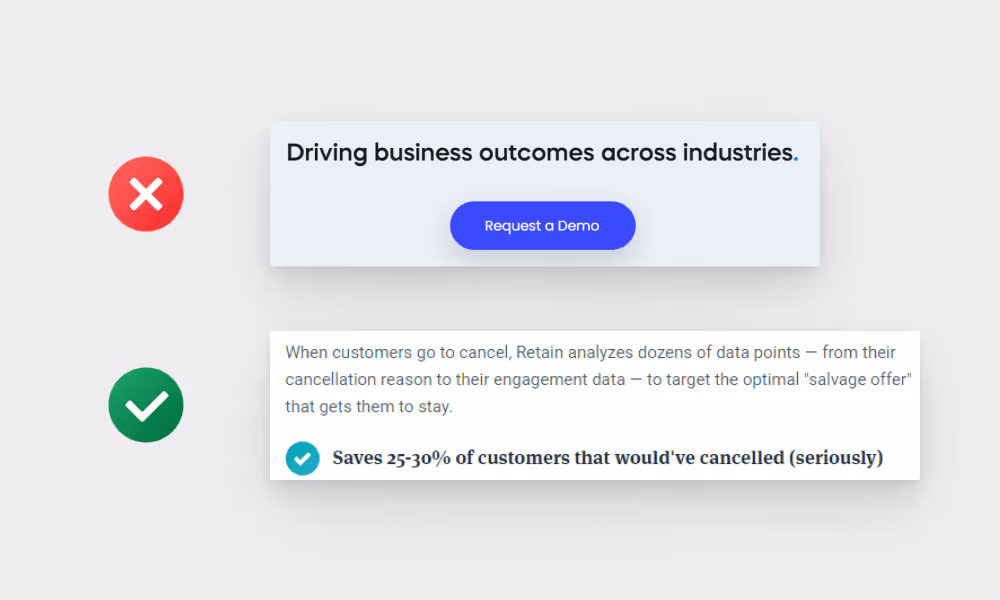
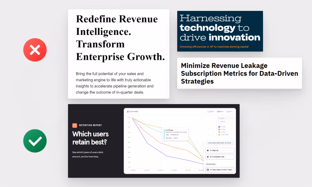
For example, instead of saying ‘grow your business’, say ‘close 30% more leads’.
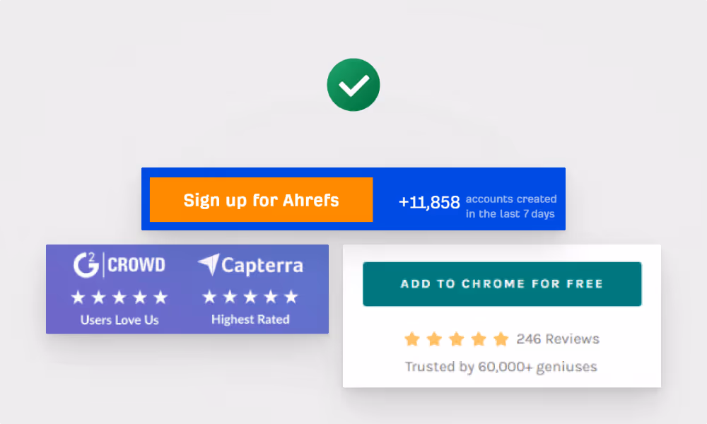
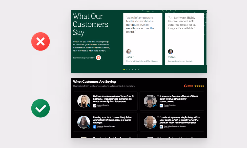
Examples: customer testimonials and their results, number of users, awards, certifications, press mentions, ratings from app stores and review sites like Capterra and G2.


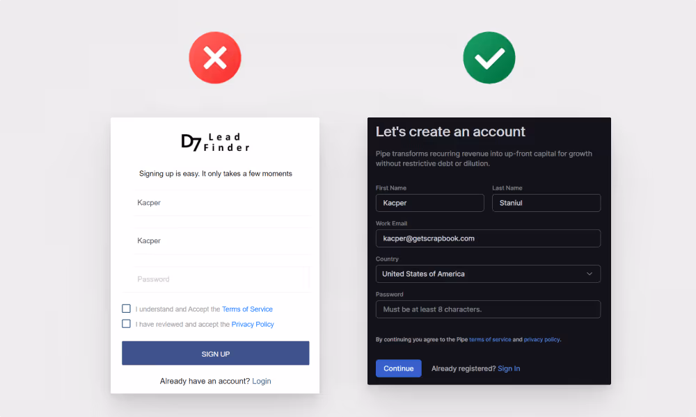
Clicking away from your landing page can result in users getting distracted by content on external websites and not coming back and converting.
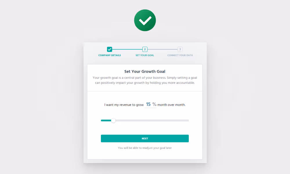
Your landing page was convincing enough to make users reach the signup screen. Now, let's make sure the UX of your signup flow doesn't cause them to drop off before seeing your product.
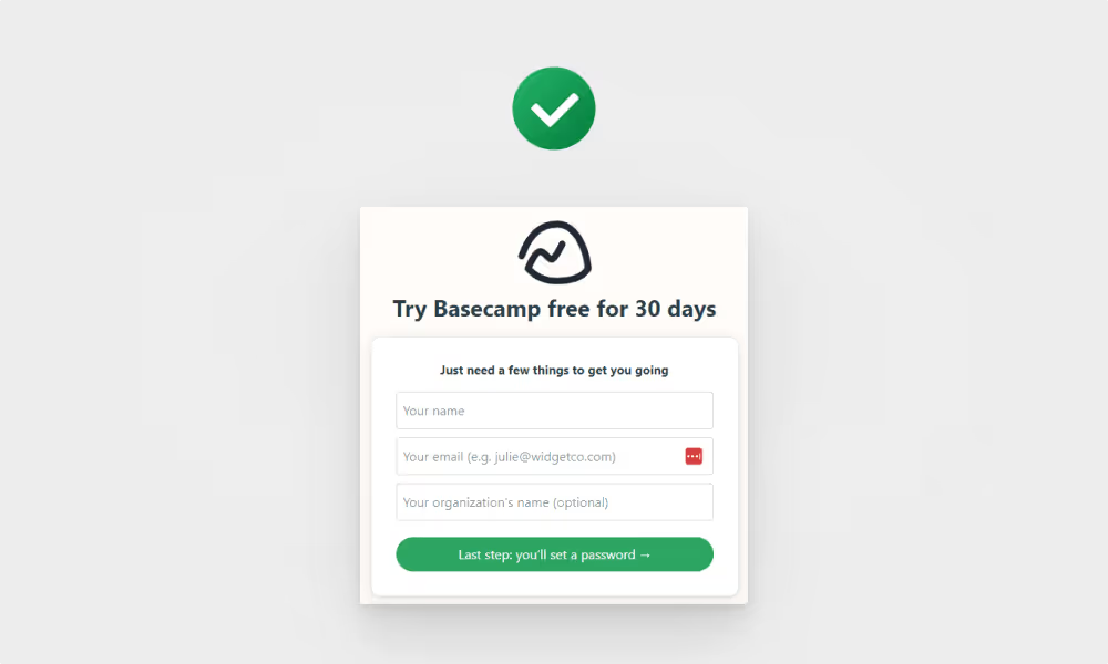
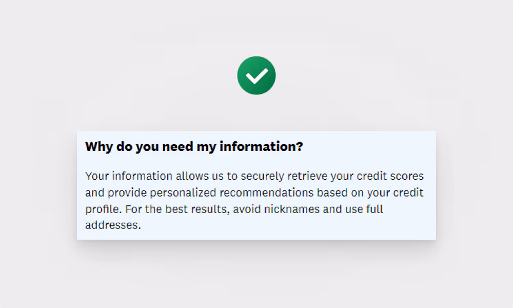
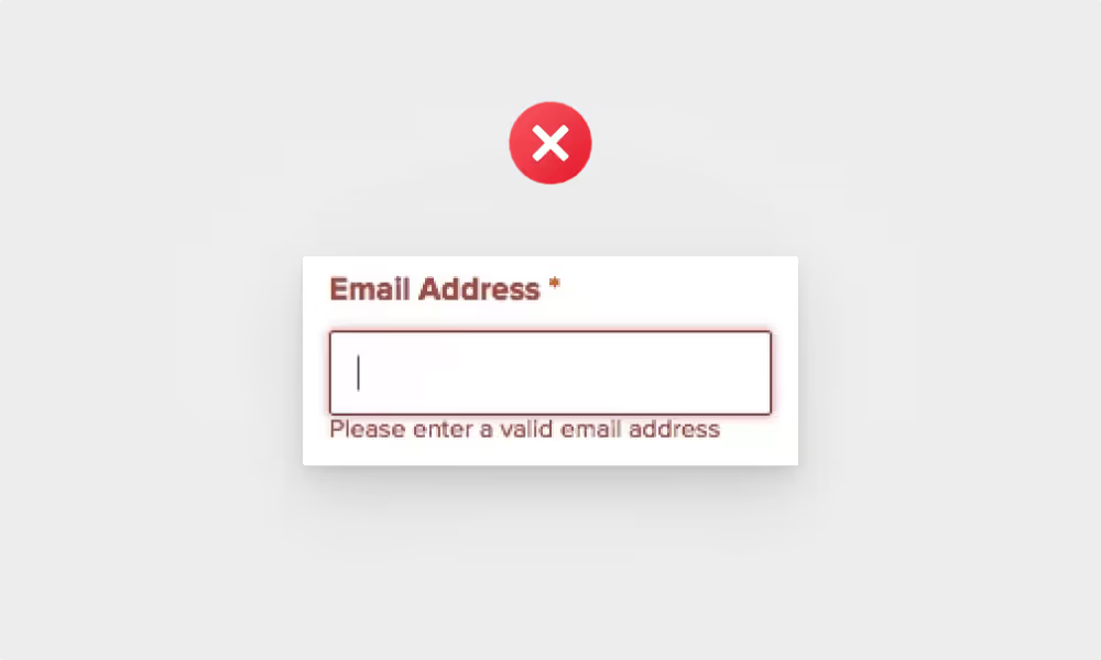
If you need some information and won’t be able to return the favor (e.g. when you’re required by law to collect it), you should explicitly say why you’re required to ask for it.
Making users leave the signup flow before finishing it can result in them getting distracted e.g. by finding other unread emails in their inbox and engaging with them. When (and if) they return to complete the signup, their motivation will most likely be lower than when they started it.
Make sure to mark the bar in a way that the first step is already partially complete. Humans are more motivated to complete a task when they feel they have already made some progress towards it (endowed progress effect).
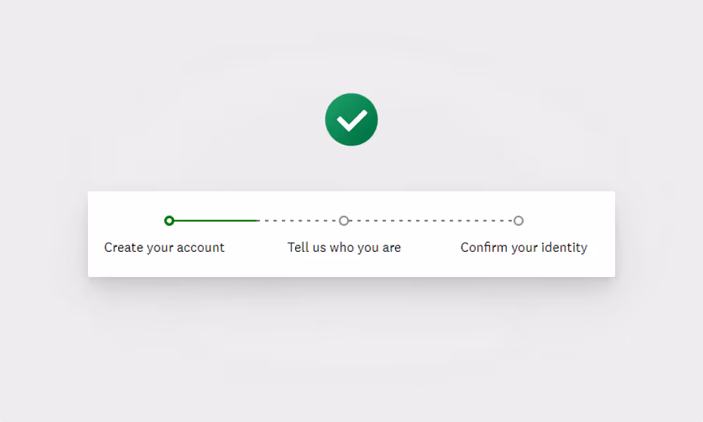
The further in the flow users are, the less likely they are to abandon the process as they don’t want their effort to go to waste.
Hotjar or Inspectlet will let you set this up easily.


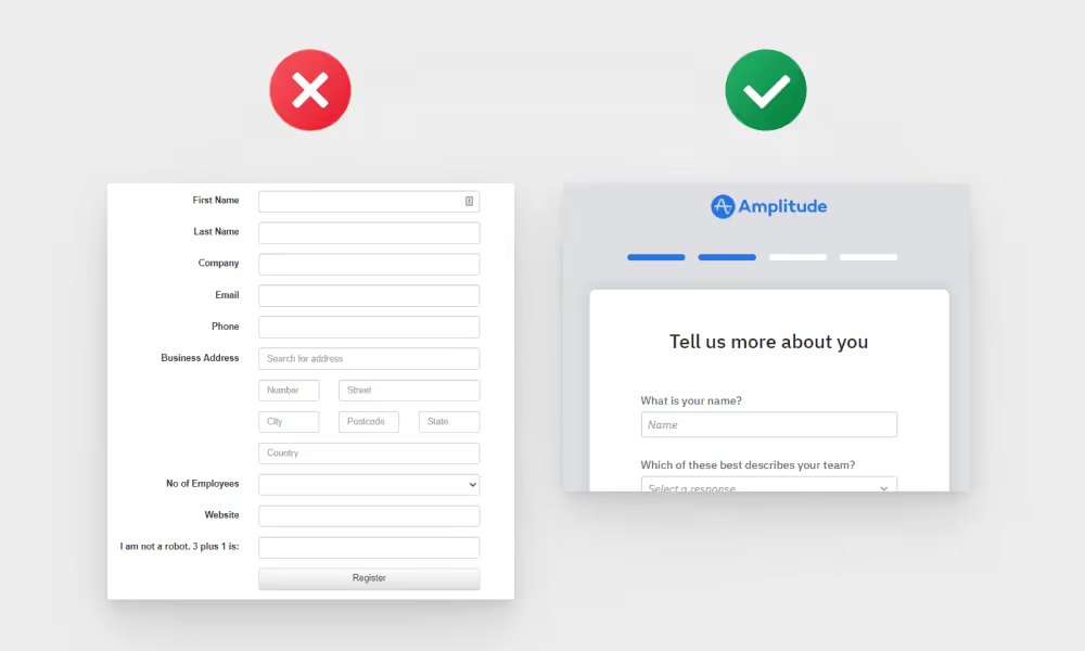
For certain data types (e.g. countries or currencies), the most popular values can be placed at the top for quicker access.


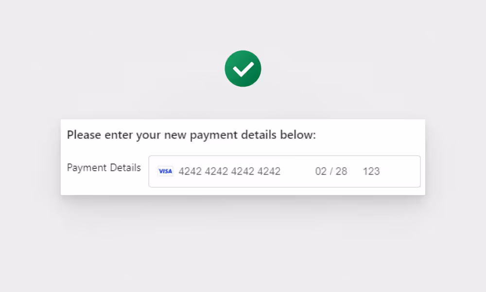
For example, the country field can be filled out based on the user’s IP, the website field based on the email domain, and B2B data like job role, company type, and size can be filled out using Clearbit API.


If you’re unsure how your target audience perceives your page, run a test on UsabilityHub to get users’ feedback about it.
Read the section copy and ask yourself: ‘would my customer say that?’
Use TTI - time to interactive metric. TTI is the time a page needs to load all content and become fully usable. Use Google PageSpeed Insights to check your page load time.
Use a cross-browser testing tool like LambdaTest to check it easily.
I’ve tried A TON of different popup tools and can honestly recommend Getsitecontrol.

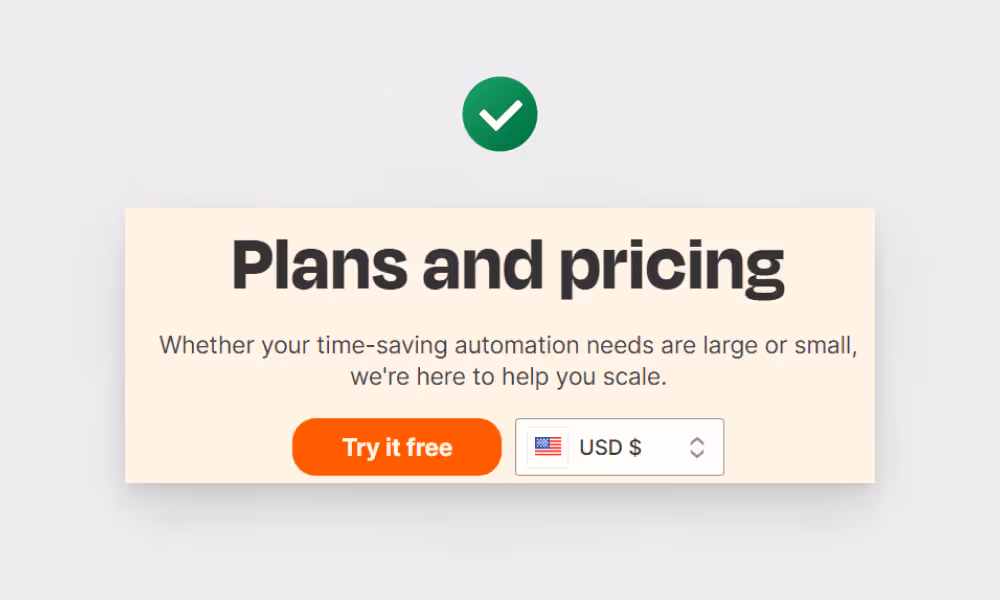
If you don’t disclose your prices at all, visitors will not only get the impression that your pricing is too expensive for them but it also makes your brand seem untrustworthy, and hard to deal with in general. If your competitors display their prices, you’ll lose business to them.
In the case of complex pricing structures that don’t let you display fixed pricing plans, either say 'starting from $x' or use an instant quote calculator.


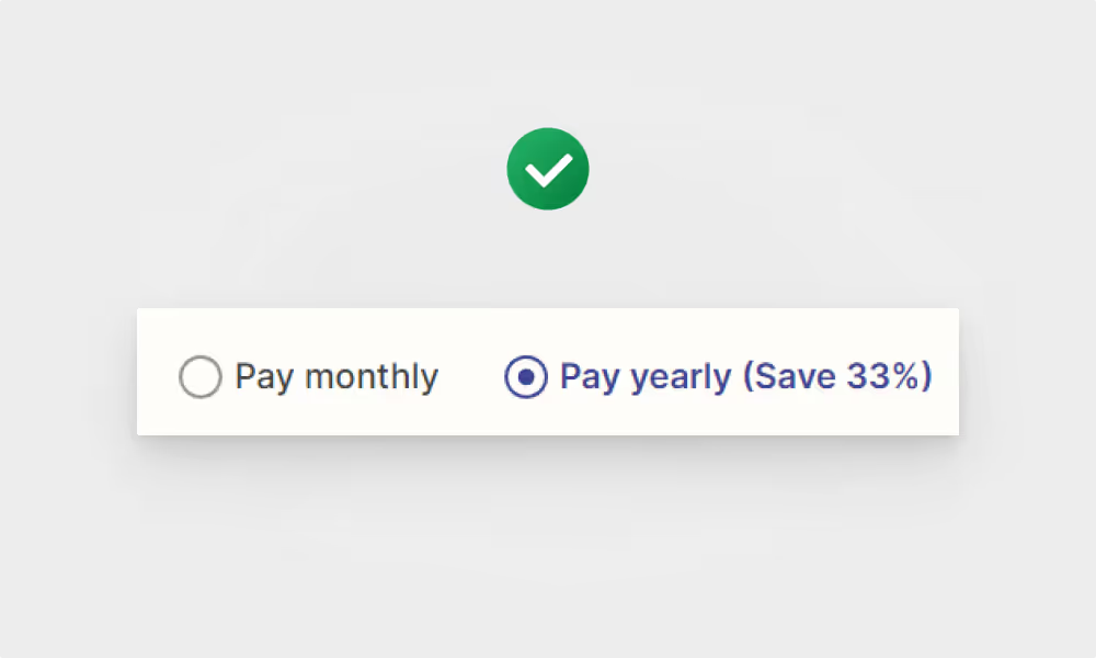
When users see a single plan, they make a decision whether to subscribe or not. When they see multiple options, they skip this consideration and jump straight into figuring out which option is best for them.
In most cases though, a 3-plan ‘good-better-best’ pricing is the best solution.
For more complex products (e.g. HubSpot), multiple pricing tables should be used.