

Kencko, which means 'health' in Japanese, is a smart food DTC brand aiming to help more people eat their recommended daily portion of 5 servings of fruit and vegetables. They offer instant smoothies that can be prepared on the go in under a minute. Each smoothie is made of organic plant-based foods and contains 50% of recommended daily fruit and veggies intake.
In this teardown, I'll take a detailed look at how well kencko's website is optimized for conversion. My goal is to identify the aspects they executed well so you can learn from them, as well as pinpoint the opportunities for improvement and my ideas on how to implement them.
As I didn't have access to any of kencko's data, my comments are based on a heuristic evaluation of their website and layering on my experience in optimizing websites.
Let's dive in.
Kencko's homepage has a simple, clean design matching both their brand and their audience.
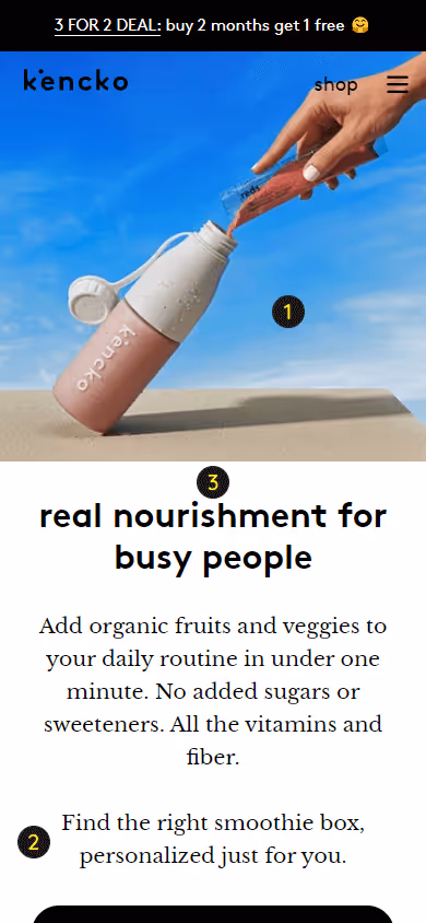
The hero section contains the 3 key elements of a high-performing hero by clearly explaining:
To help further set the context, the hero image shows the smoothie powder being poured into a kencko-branded shaker bottle leaving no doubt what the product is and how it's used.
An added benefit is that kencko promises that the smoothie box will be personalized to your needs.
My only remark is that the headline is a bit vague. What does 'real nourishment' actually mean?
%20(1).webp)
On most mobile devices, both hero CTA buttons are under the fold, which is not ideal, especially that the primary CTA 'take the quiz' is an integral part of the last sentence from the paragraph above it.
%20(2).webp)
The second section does a good job of expanding on the benefits mentioned in the hero. Notice how this is all relevant to their target audience of busy people ("quick, healthy boost - wherever you are").
The highlight of this section is the image though. It's a perfect example of how visuals should be used so that as much information is conveyed without making users read the accompanying text.
%20(3).webp)
As consumers are getting increasingly sustainability-conscious, as well as expecting brands to do the same, kencko talks about both these aspects in this paragraph:
Two other benefits of being environmentally friendly are that it increases consumers' willingness to pay, and increases their satisfaction with using the product.
%20(4).webp)
Kencko uses this section to be transparent about some of the doubts users have and to overcome them right on the homepage.
💡 Pro tip: if you're aware of a common objection your target audience has, make sure to answer it proactively. Don't make visitors search for an answer to their doubts as most likely they'll leave before they find it.
%20(5).webp)
Offering a personal nutritionist is a really interesting move. Not only can it be an attractive incentive to start the subscription but above all a potentially high-impact retention play. I'd be very curious to know the results of this tactic.
The 'get started' CTA doesn't match the section content though. As the paragraph talks about the nutrition coach, you'd expect the button to lead to a page going into more detail on how the coach will help you. However, it links to the product page.
%20(6).png)
Further down the page, we can see some more reasons why users should choose kencko and its smoothies. Each feature has a custom icon making the section easier to scan.
%20(7).avif)
The goal of the homepage is to move visitors down the funnel. For those that are still early in the buying cycle and need extra information about smoothies and their benefits, showing educational content can be a good idea, provided it eventually leads them down the funnel.
However, kencko just displays their most recent blog articles. And this leaves the traffic path to chance, especially that their blogposts are not optimized for conversion at all (the blog needs a teardown of its own).
💡 Pro tip: when displaying a content section on the homepage, either use your highest converting blogposts or some lead capture content such as a cheatsheet, email course, or anything else that will let you stay in touch with visitors that didn't convert during their first visit.
%20(8).png)
At the bottom of the page, there's a testimonials section that could be easily improved by adding pictures taken by these satisfied customers. Especially that kencko's colorful smoothies are very photogenic. This would make the testimonials more reliable and enhance the social proof effect.


Users can get a sample pack. The LP doesn't mention any samples though and the headline talks about a monthly subscription which means commitment - the opposite of a sample. Yes, the copy below goes on to explain that users can cancel their subscription after one box but this should be crystal clear right away.
Happiness and money-back guarantee. No such information is displayed on the landing page at all which can make some users feel tricked into clicking the ad.
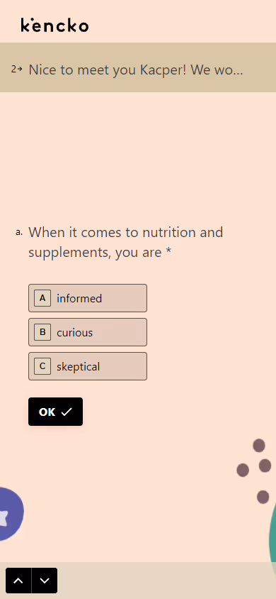
Using Typeform, they've created a monster 22-question quiz consisting of 3 parts:
They've also included an attribution survey (1 question) at the end.
Notice how kencko creates a distraction-free experience by removing both the navbar and footer as early as on the product details page. As there are no other products users might want to add to their cart, completing the purchase is the only focus here. This is the recommended setup for single-product stores.
🚀 Scrapbook tactic #6 - Tunnel Checkout: remove header and footer from checkout to create a distraction-free 'tunnel'. Reducing the number of options a user has will increase the chance they will perform the action you want them to take and proceed further in the checkout process.
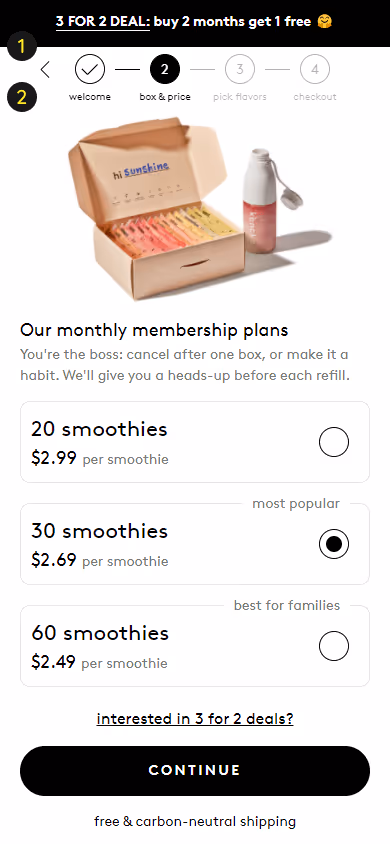
They also display a progress bar signaling how quick the whole subscription process is.
🚀 Scrapbook tactic #142 - Progress Bar at Checkout: show visitors how close they are to completing their order and reduce cart abandonment using a progress bar.
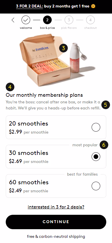
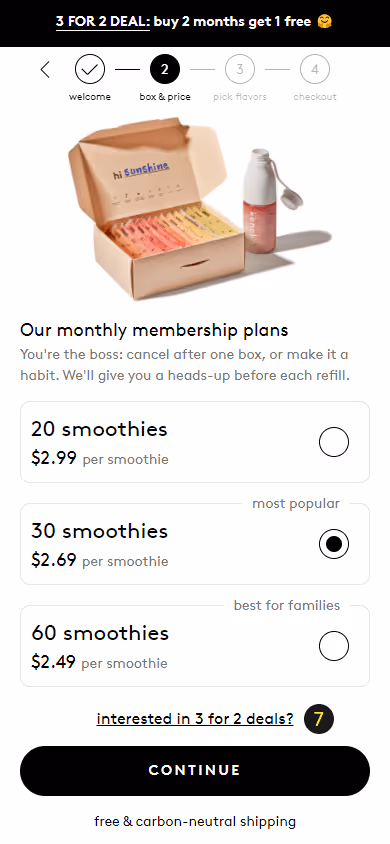
Product images are of good quality and change based on the selected box size. Even though there isn't a big difference between the boxes, they made sure not to neglect such a detail.
Whenever you can, avoid using the words 'our' and 'we' and focus copy on the user. They answered the quiz to get a personalized recommendation, after all, so kencko should make it sound like the plan was created for their users' needs.
The copy below is well-thought-out. It answers some of the common doubts early in the subscription process.
The labels try to incentivize users to select a higher subscription plan. They probably don't have much of an impact but it doesn't hurt to have them.
Kencko offers free shipping on all orders above $50 but doesn't show this info anywhere until the final checkout page. It's a common question among any store's visitors so kencko should address it as soon in the subscription flow as possible.
Another tactic kencko uses to increase the AOV is a 3 for 2 deal. They neatly mention that it takes time to build a healthy habit so a longer subscription will help users achieve their goals. And they do a good job again at overcoming uncertainties and doubts in the copy.
%20(2).png)
The product details page is clearly on the short end. Below the subscription selection, there are just the 2 sections we've already seen on the homepage.
For users who landed on this page from an ad or after just seeing the homepage hero, this is not enough information to convince them to subscribe.
To quote CRE:
As a rule of thumb, your page should contain at least as many words as you’d use when selling your product or service face to face. That’s because you don’t have the luxury of being able to ask for objections, so your page needs to address all of the most common objections.
What information is missing and could help persuade visitors that they need kencko's smoothies: a general description of the product and its health benefits, ingredients, nutritional info, images of other customers as social proof, product ratings, info about the nutrition coach being included in the subscription, and FAQ.
By overlooking these elements, kencko is not only hurting their conversion rate but also missing out on some valuable SEO traffic from phrases such as smoothie powder, smoothie mix, smoothie subscription, and more, with thousands of monthly searches. Not to mention the lack of heading tags, meta description, and an unoptimized meta title.
%20(4).png)
%20(5).webp)

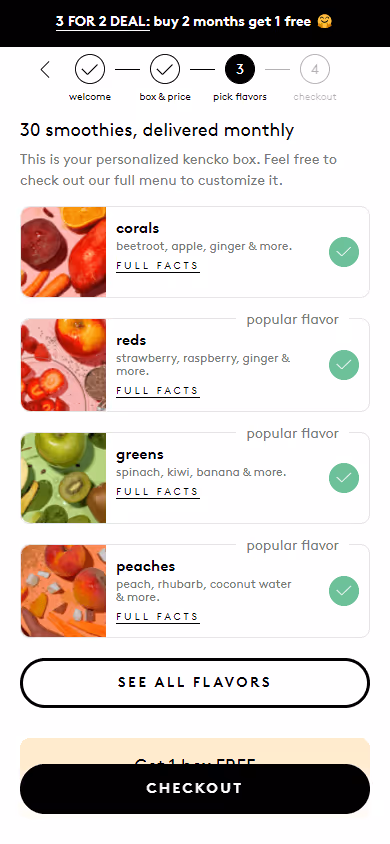
Below the flavor selection, kencko makes another attempt at upselling users to a 3 for 2 offer. It's benefit-driven ('get 1 box free') and very unintrusive, so well done on this.
There are also the shaker bottle and dietician offers which are free with all orders. It definitely helps as an extra incentive to push the undecided users towards the next checkout step.

What can be problematic here is that because all 3 offers are below the fold, they might be missed by some users. Especially on devices (iPhones 6 Plus to X) where the two CTA buttons create a false bottom - an impression that the page will not scroll further because no page elements below the fold are visible.
The more motivated the users are to complete the purchase, the less likely they are to scroll, as they don't need more information.
That said, it would be interesting to see a scroll map to check if that's actually an issue here. If that's the case, displaying a popup with a reminder for users who didn't select one of the offers would help fix this potential issue.
.webp)
The last step of the checkout flow is the summary and shipping which is a standard Shopify page.
The key thing missing here is the alternative checkout options, such as Apple Pay and Google Pay, which are a sure way of increasing the conversion rate.
Kencko does many things well in terms of how their site is optimized for conversion. Their homepage, aside from some minor remarks, is solid. Their distraction-free subscription flow is something that other single-product stores should adopt. And the free nutrition coach offering has the potential to be a great retention move.
The optimizations that could move the needle most are shortening the quiz length, beefing up the product pages with content justifying the product price and answering objections, and switching the order of checkout steps. On the ads front, kencko would surely benefit from creating a more cohesive ad-landing page experience.
Based on this, kencko gets a decent optimization score of 6/10.