
Today I analyzed the landing page of Every Man Jack which is a men’s grooming brand offering natural products in outdoor-inspired scents.
They used this LP in a humorous campaign featuring Beardles, a fictional band, to sell their product bundles.
Here are my thoughts on this page.
1/ The whole campaign has a humorous theme and humor helps people to remember information better (source 1, source 2). It’s also the right amount and type of humor to keep users engaged without feeling overwhelmed or lame.
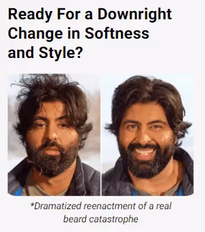

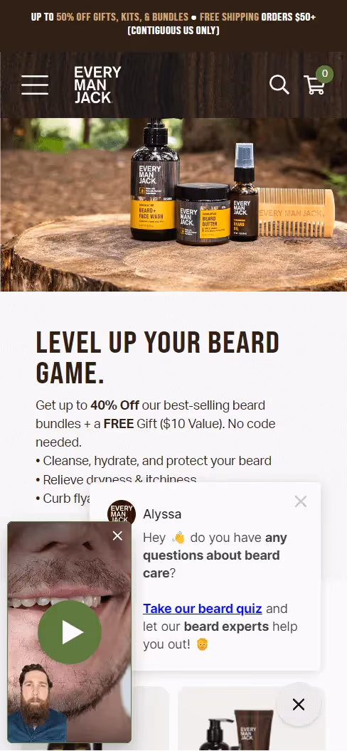
2/ The hero section has more good than bad:
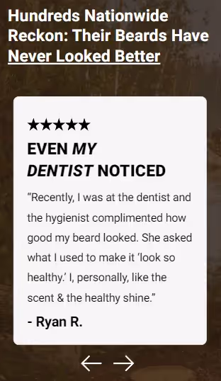
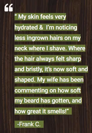
3/ The featured reviews are very specific about the actual results of using the product which is exactly what you want them to be. To make them more believable, they should also include some kind of a “verified customer” badge, and if possible, customer image (ideally holding the product).
The second review looks ugly and hard to read but I’m not gonna comment on the design as that’s outside of my expertise ;)
1/ The section content below the hero is not specific enough. Saying that a product is “sustainably minded” is as generic as a software product saying that it will “grow your business”.
The more generic a statement, the less believable it is.
Similar case with “clean ingredients” - why not mention and/or show some of them?

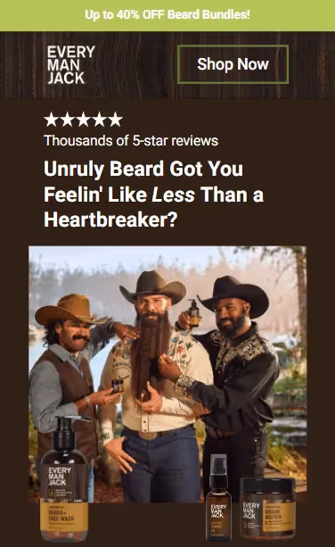
2/ The order section has 4 bundle options. 3 of them are discounted, and the last one is a new “small batch” collection bundle that’s not discounted and labeled as “premium”.
I’m not sure what’s the reason for including the 4th bundle here as it clearly looks like the inferior choice because of the price and no explanation of what makes it premium.
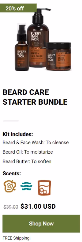
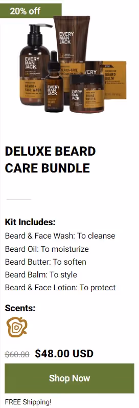
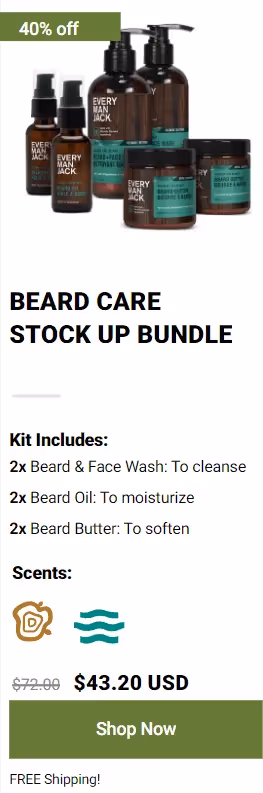
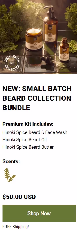
Also, while the scents are described in the section above, the product section only contains their icons. So if users want to know their meaning, they have to scroll up and down. Don’t make them do that - just put the names below the icons.
But, the biggest issue is that the “Shop Now” buttons drive the traffic from the landing page to PDP.
This is the exact opposite of what a landing page should be used for. It should make the shopping journey shorter, remove distractions, and make the decision easier.
3/ There are quite a lot of CTA buttons on this page, each of them with a different copy though. This can leave users confused if they all lead to the same destination.


And, similar to the ‘Shop Now’ buttons, they lead to a collection page with 8 different choices, making the shopping decision only harder for users.
4/ While this section is pretty decent at highlighting the problem and mistake most men make, for some reason it’s placed in the bottom part of the LP, far below the order section.
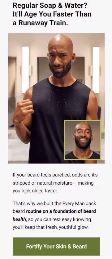
If you’re familiar with the PAS copywriting framework (problem - agitation - solution), you know you should begin with the problem, and then present your product as the solution to it. Reversing the order makes little sense.