Hollow manufactures performance socks made from alpaca fibers that provide better comfort, thermoregulation, and durability than wool. They cater to hunters, hikers, skiers, and other outdoor lovers.
Their landing pages include a mix of listicles and sales LPs. The one I analyzed today though is a combination of both: https://hollowsocks.com/pages/a40-hunting-boot-shoppable
Let’s have a look at its pros and cons.
1/ Instead of using the listicle to drive traffic to a separate sales LP or a product page, Hollow shortened the shopping journey by adding a shoppable section to the bottom of the listicle. This makes a lot of sense, especially for unsophisticated products like theirs.
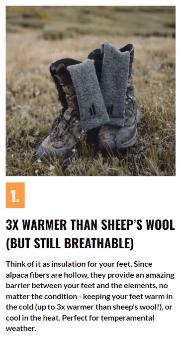
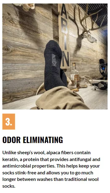
2/ The listicle’s benefits are compelling and all images show the product in real-life situations making it clear who the product is targeted at (outdoor enthusiasts).
1/ The purpose of a listicle is that users actually read the arguments explaining why a given product is the right solution to their needs. But if the CTA button in the hero section scrolls the page straight to the shoppable section, it makes the listicle pointless. Users will see just the limited shoppable content which is not enough to convince them to buy the product. This is by far the most serious issue with this LP.
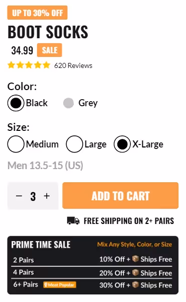
2/ The shoppable section incentivizes visitors to order more than one item using free shipping and volume discounts. There’s also a money-back guarantee. But…
It also has a couple of issues:
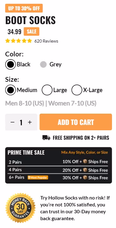
3/ While there is a star rating and review count displayed, the section is not clickable so users can’t read the reviews or even verify if there are actually so many positive ones. That hurts Hollow’s trustworthiness.
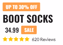
4/ How much will I pay in total for 2 or more pairs? And how much will I save? Remember, never make users think - it unnecessarily depletes their mental energy. And when this energy level drops too low, they’ll abandon the shopping process.
So in this situation, the total price should be dynamically updated when users change the number of items. And to make them feel better about their purchase, Hollow should display the savings thanks to the volume discount.
5/ The review section contains 3 testimonials that mention specific benefits of Hollow socks that customers like, which is great. However, this section would look much more authentic if it: