I’ve written about Javy’s impressive upsell flow in the past. This time, let’s have a look at one of their new landing pages.
Javy is a DTC brand offering coffee concentrates that are quick and convenient to make, and taste delicious.
Here’s the LP of their new product, protein coffee.
1/ Desktop version of the page has a navigation bar that gives the page a feeling of a regular store, more familiar to users than a navbar-free LP. Instead of driving users to other pages, the links offer convenient navigation, scrolling the page to respective sections.

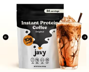
2/ Hero section:



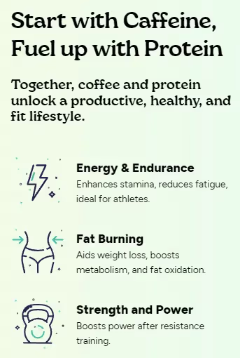
3/ The following section nicely presents the benefits of caffeine and protein working together.
4/ The first two testimonials are great as they confirm what the landing page said before about the benefits of coffee and protein combined. This makes Javy seem more trustworthy. The third one is very generic though and doesn’t help much.

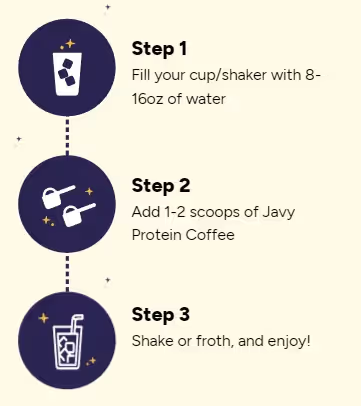
5/ Next, there’s a section showing how straightforward the process of preparing a drink is. Can't get any clearer than this.

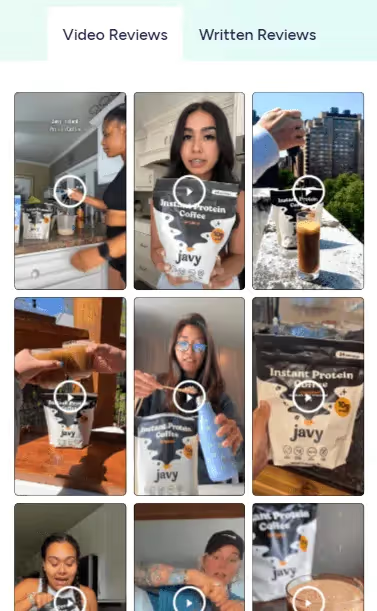
6/ Javy’s landing pages are always full of social proof and this one is no different. They display the rating breakdown, video, and text reviews. Main focus is of course on video content, as most traffic comes from social channels.

7/ At the bottom of the page, there’s a comprehensive FAQ section, which is great. At the bottom of the screen, there’s a sticky add to cart button so that users don’t have to scroll the page back up after deciding to order.

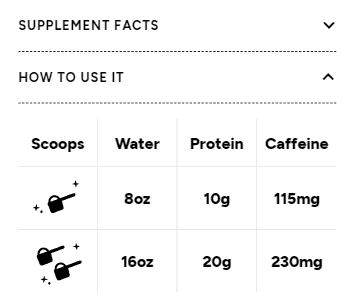
1/ The “how to use it” section in the hero section doesn't really answer the question properly. Users still don’t know if they need a shaker, blender, or something else to prepare the drink.
2/ “Most premium in existence” is a very bold statement but is not backed by any proof. It would be good if Javy explained what makes it so premium to sound more trustworthy.

3/ The features section is a bit plain and would do with icons to make the content easier to digest.

P.S. View 300+ other pages in the DTC landing page gallery (added 6 new ones last week).
