NoonBrew is a superfood blend tea “for the afternoon slump”, as they say.
Here’s the LP we'll have a look at: https://noonbrew.co/pages/v5-starter-kit
1/ While the hero section looks a little crowded because of the amount of text, it does a lot of things right:
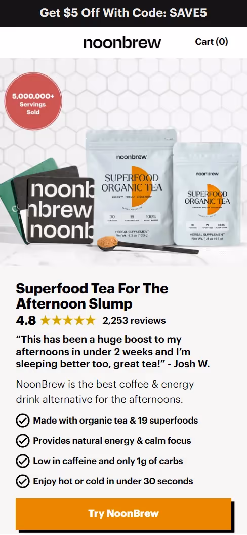
One thing I’d improve here is adding a mouthwatering image of NoonBrew when it's ready to drink (like Javy does) instead of the coaster set.
2/ They first display the 3-pack, followed by the 5-pack, and lastly, a single pack.
.avif)
Here's how this is a win-win situation for them in terms of increasing the AOV and LTV.
First, they're incentivizing users to pick one of the 2 more expensive options by:
Then, if visitors pick the cheapest option, it's not a one-time purchase but a subscription. Which means it will bring NoonBrew more revenue than just $39.
3/ The next section goes through the key ingredients of NoonBrew and their benefits in an easily digestible way and their graphics help with that.

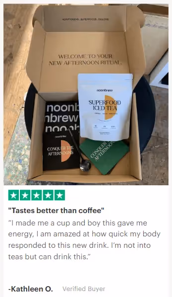
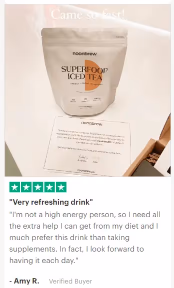
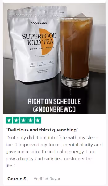
4/ The testimonials picked for this section mention specific benefits and include product images, and reviewers’ names, which is best practice.
5/ Next, there’s a standard comparison chart that makes NoonBrew look like a clearly better alternative to other caffeine drinks.
Notice that NoonBrew doesn’t compare their product with their direct competitors (other superfood drinks) but with traditional drinks, as that’s their target audience’s default choice.

For more good examples of comparison charts, check Scrapbook tactic #185.
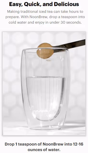
6/ GIFs illustrate how easy and quick it is to prepare NoonBrew. Whenever you can explain something visually, it’s always a better choice than describing it with plain words.
7/ I really like this section because it makes visitors self-qualify for NoonBrew’s offer by answering “yes” to these questions in their heads.
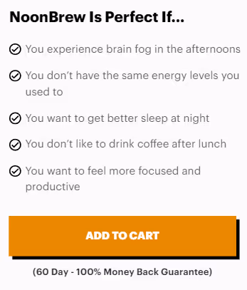
It creates an impression that their decision comes from themselves instead of being sold to.
And humans in general don’t like being sold to.
So this is a great section to put before a mid-page CTA button.
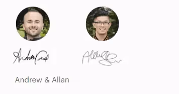
8/ Founder story builds a more personal connection with visitors as it makes the people behind the product more relatable because of having the same challenges - the afternoon slump in this case.
NoonBrew founders describe the issues that made them start the company, how the product they developed helped with these issues, and how Allan’s background is relevant (which adds credibility).

The section ends with both founders’ images and signatures for an extra personal touch.
More great founder story examples in Scrapbook tactic #191.
I didn’t find any major flaws with this landing page.
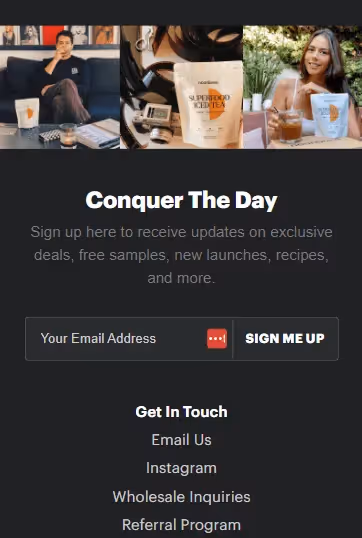
One thing I’d definitely test though is adding more delicious-looking product images throughout the page. UGC whenever possible.
Javy does this well:
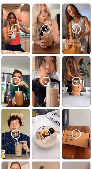
NoonBrew only has a couple of such images… in the footer of the landing page.