
Truvani offers health supplements, plant-based protein powder, and personal care products without added chemicals.
The LP I analyzed is a monster page full of credibility and social proof elements, that leaves visitors with no questions unanswered.
Here's the link: https://shop.truvani.com/pages/protein-package-fb45
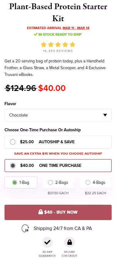
1/ Very strong and clean-looking hero section:

2/ Certifications and icons increase trustworthiness + are good for users skimming the page.

3/ Video testimonials are used to back up the claims about the taste and ingredients. This is one of the best ways you can make your copy credible: a section mentioning some feature/benefit + a testimonial mentioning this specific aspect of the product following the section.


4/ Truvani’s co-founder is using her own brand to endorse the product which is a sure way of boosting credibility.

5/ Here’s what a solid “show don't tell” section looks like. It doesn’t just say that Truvani’s ingredients are far superior to their competitors. It shows the labels side by side so visitors can clearly see the difference.

6/ A big discount and tons of free extras make the offer seem hard to turn down.
One thing to improve about this section though is that discounts work best when justified with some special occasion, so it would be worth adding that in (even if it’s something silly as international protein day).

Then, the Length Implies Strength Heuristic (more copy makes the offer more convincing and valuable) in action. Notice how the value of every single one of the 8 elements of the offer is described in its own section (even the recipe guides).
7/ The order section is clean and strong:
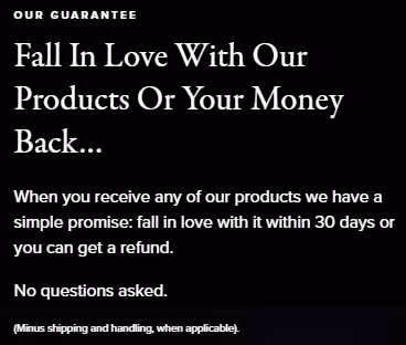
8/ There’s also a no-questions-asked satisfaction guarantee. Notice the wording - they don’t use the usual “if you’re not satisfied” but “fall in love”. This makes Truvani extra confident in the quality of their product.
9/ And finally, aside from a comprehensive FAQ section, they make their support team easily reachable without having to look for a ‘contact us’ page.

This LP is really well-built and it’s hard to find any major flaws. So just 2 minor things.
1/ The countdown creates fake urgency which can negatively impact Truvani’s trustworthiness. First, they’re not gonna run out of a product they’re driving ads to. And second, how would they know the exact time when the product runs out?
Even if not many users will realize it, it’s best to avoid dishonest tactics like this.

2/ The review section is in the top 10% of the page which is a rather uncommon move.
It might be beneficial because of the large number of reviews and high rating but could also cause a false bottom effect (when visitors think they reached the end of the page and won’t scroll more), especially since we’re used to seeing this type of section at the bottom of the page.
But, this is just a heuristic analysis and to learn the actual performance of placing this section so high up the page you’d have to see a scroll map report.
Another thing is that the review counts within the section don’t match (32,707+ vs 7517) which may make visitors question Truvani’s honesty.